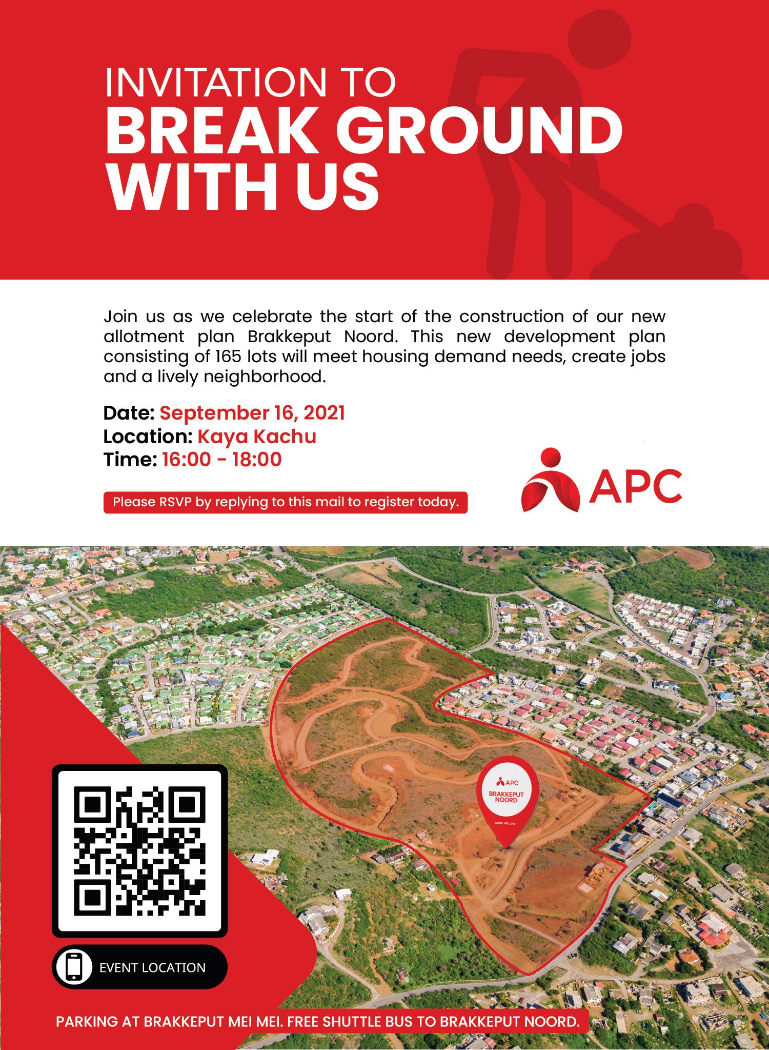
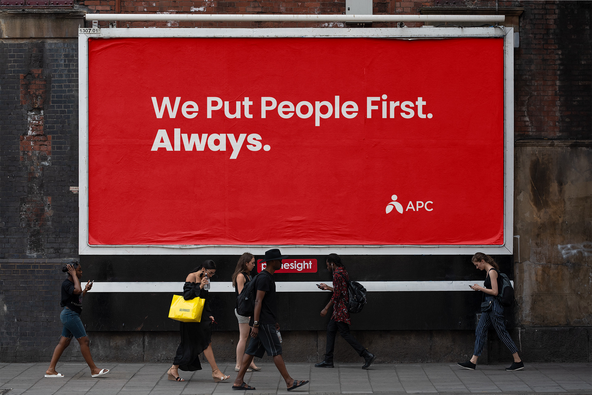
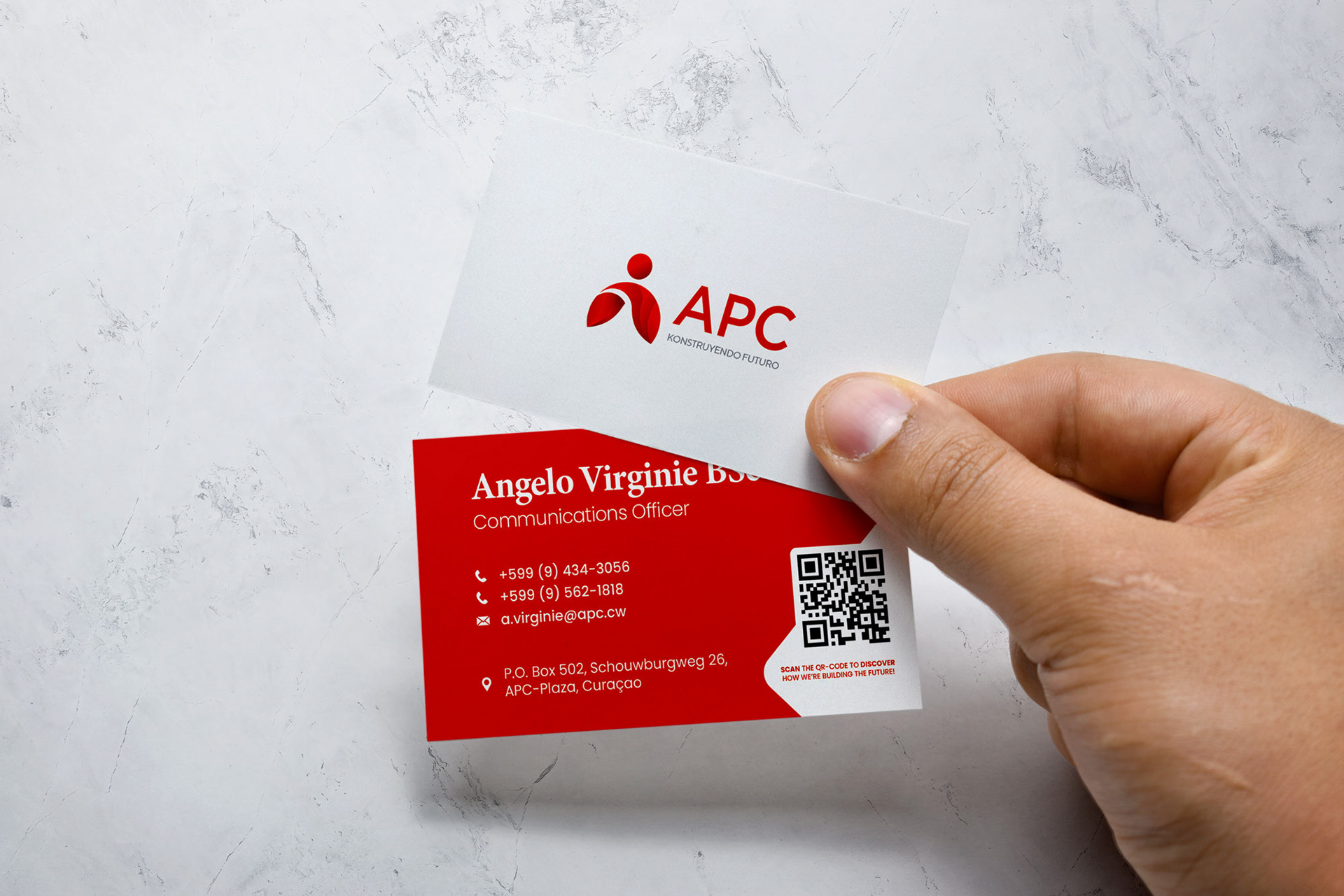
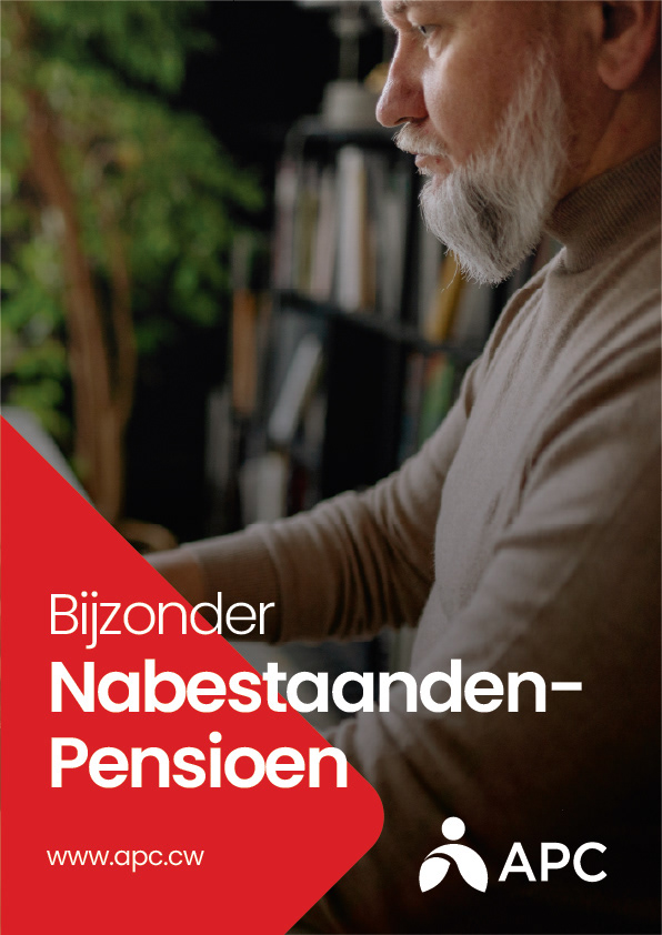
As a designer working on the re-branding of the Algemeen Pensioenfonds Curacao (APC),
The objective of the re-branding initiative was to give the APC a fresh and modern look, while still retaining its established brand identity.
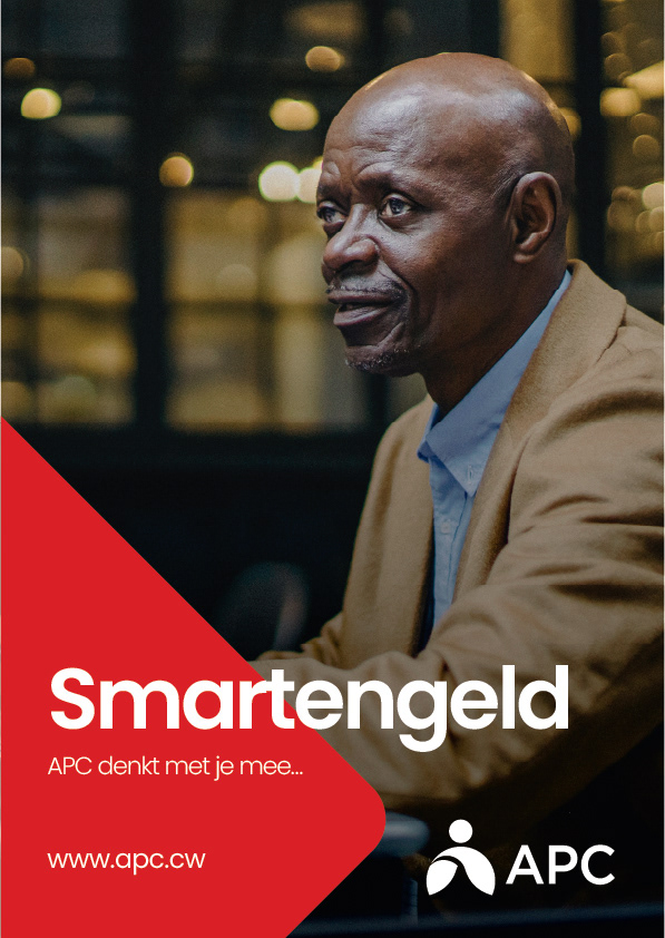
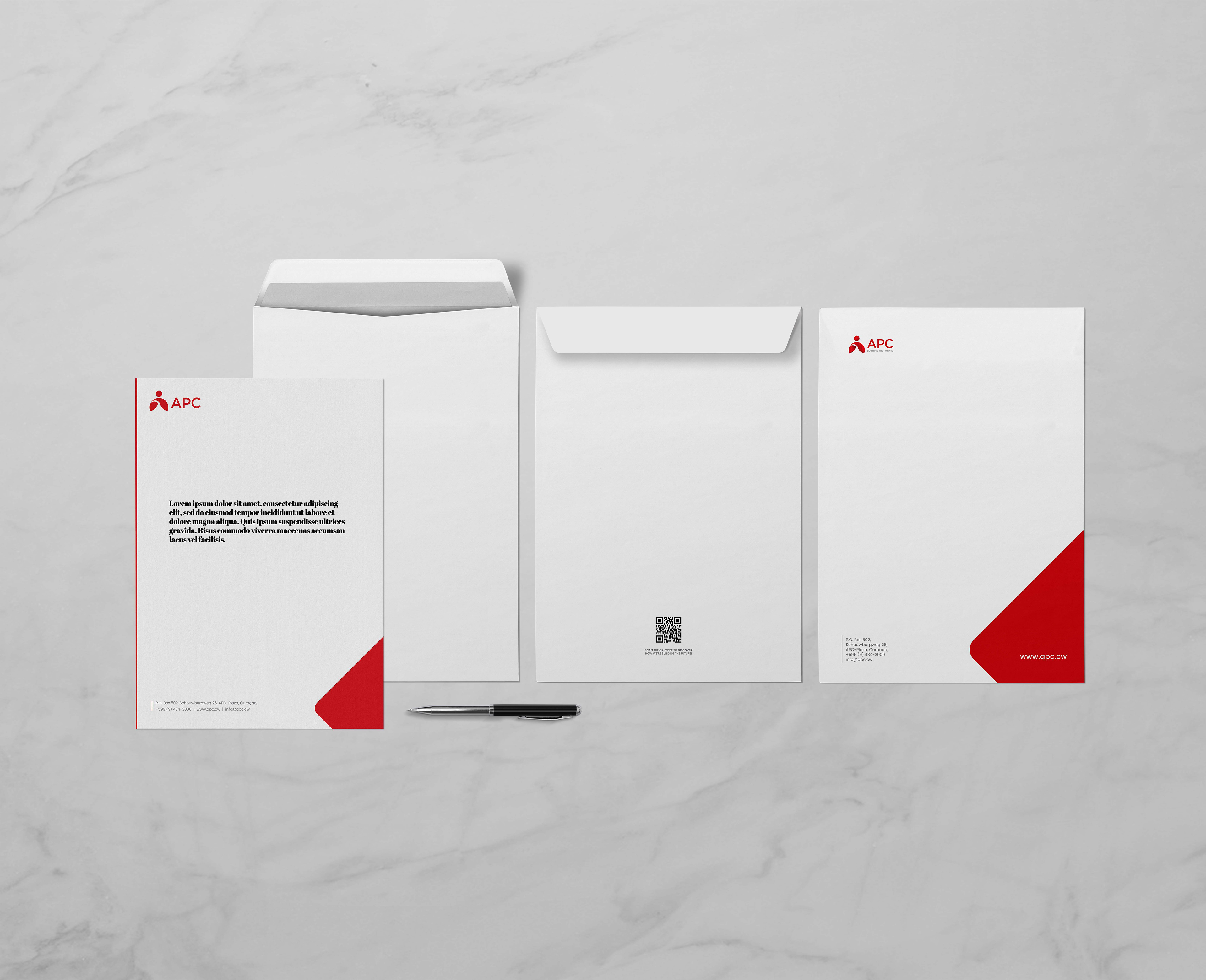
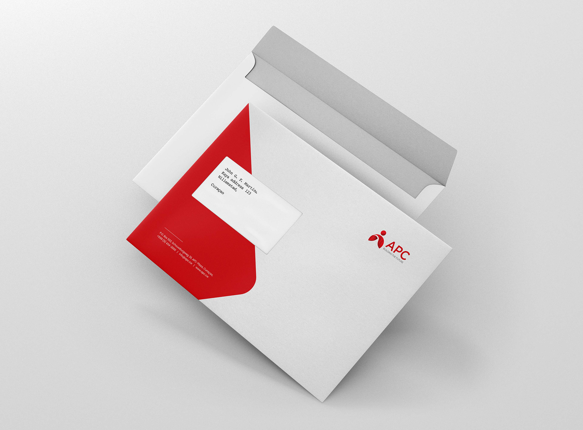
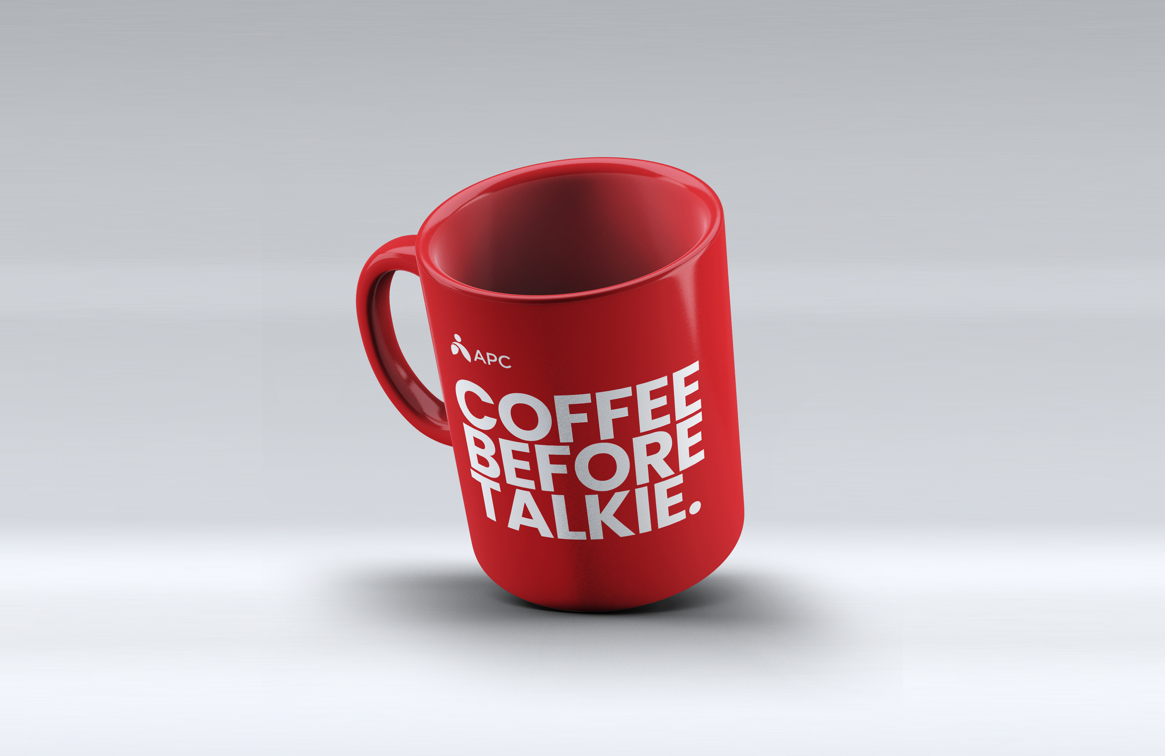
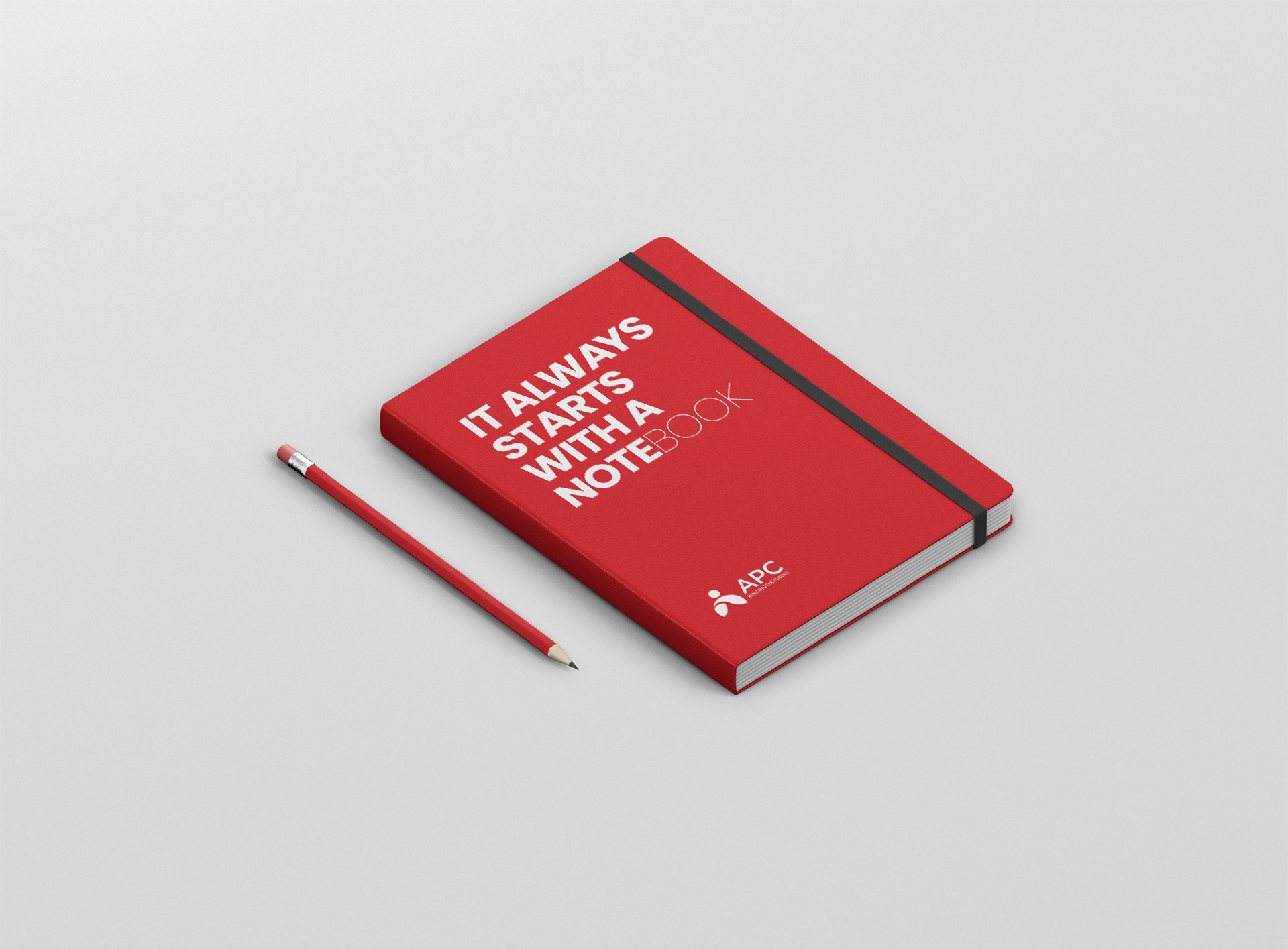
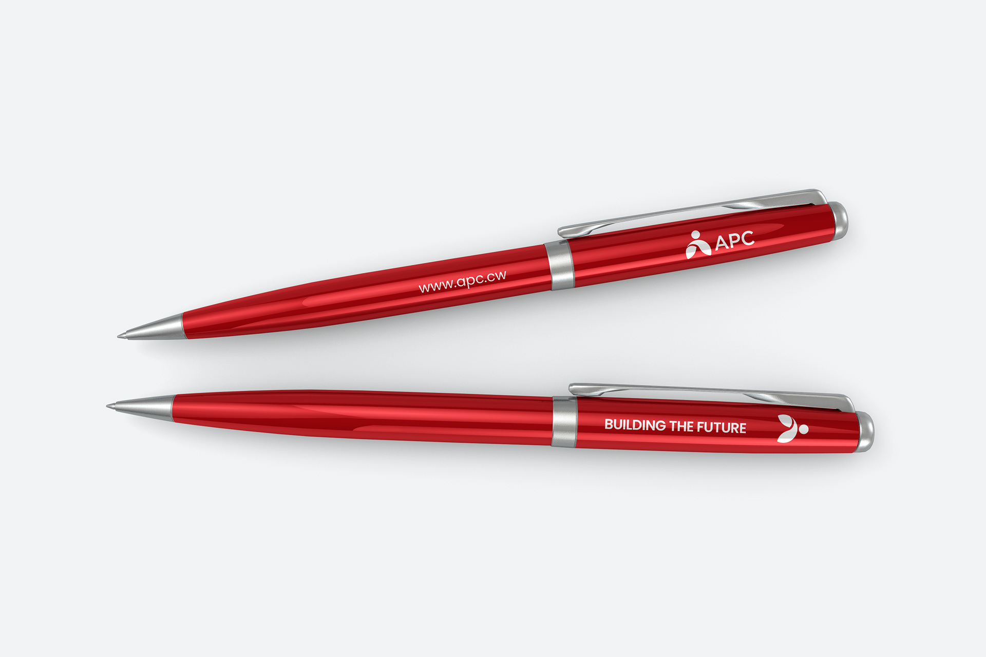
We achieved this by modernizing and flattening the logo, which had become synonymous with the organization's reliability and trustworthiness. However, we retained the primary color, red, as it has deep roots in the organization's history and is a key element in maintaining brand recognition. In addition to the updated logo, we created new brand elements that reflect the organization's
core values and enhance communication
The APC's new branding is not only visually appealing but also reflective of the organization's values, providing exceptional pension services.
The objective of the re-branding initiative was to give the APC a fresh and modern look, while still retaining its established brand identity.
We achieved this by modernizing and flattening the logo, which had become synonymous with the organization's reliability and trustworthiness. However, we retained the primary color, red, as it has deep roots in the organization's history and is a key element in maintaining brand recognition. In addition to the updated logo, we created new brand elements that reflect the organization's
core values and enhance communication
The APC's new branding is not only visually appealing but also reflective of the organization's values, providing exceptional pension services.